Cultured crust.
The Brief
A concept identity for an artisan bakery — warm, modern, and quietly premium. Loaf needed to feel handmade without looking rustic, and refined without going cold.
So a high-contrast serif does the craft, a sliced-loaf mark keeps it warm, and a single stroke of gold signs off the whole thing. Bread, taken seriously — but never too seriously.
The Mark

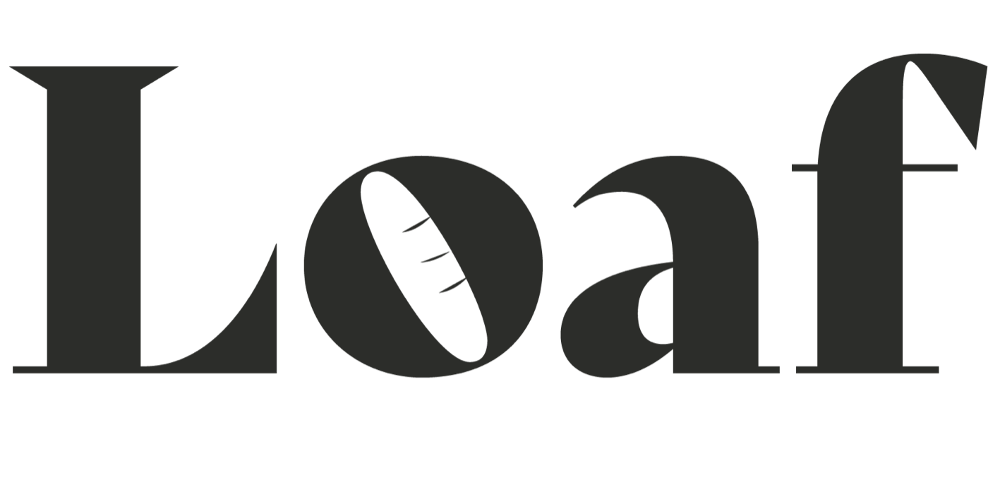
The counter of the o becomes a cross-section of fresh bread — so the logotype carries the product inside the name. It works as a full wordmark on a shopfront and collapses to a single warm mark on an app icon.
The Palette
A warm near-black does the heavy lifting; cream keeps it appetizing; and gold shows up in one thin line — on a box edge, a hangtag, a rule — to signal "worth it" without shouting.
In The World
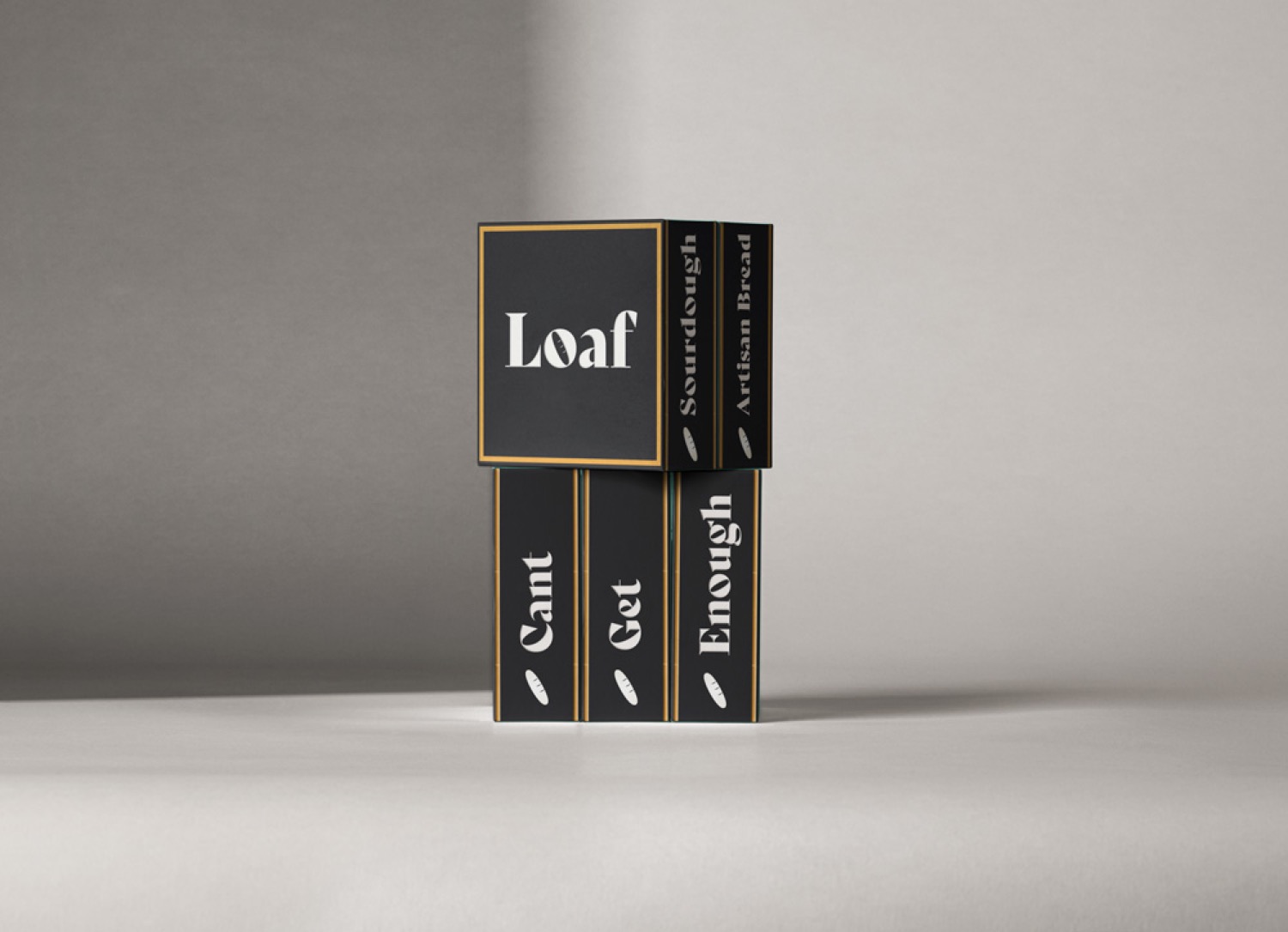
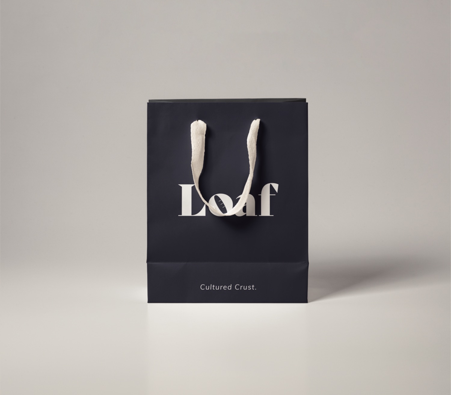
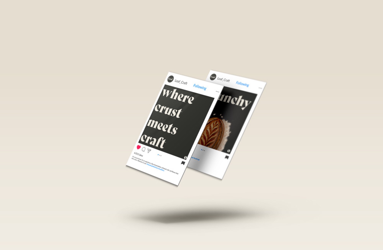
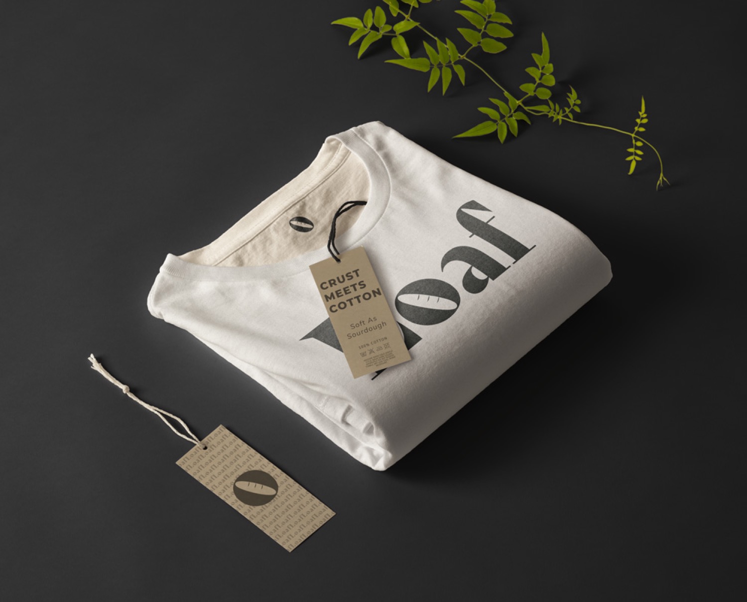
A supporting pattern of tiny baguettes turns any blank surface — tissue, a bag base, a loading screen — into Loaf. Used sparingly, it's the brand humming in the background.

Voice & Social
Crust, with
a caption.